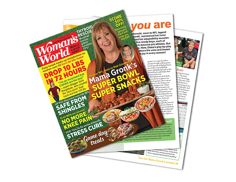
How to Create an Effective Book Cover

Creating an effective book cover is essential for attracting potential readers and communicating the tone and themes of your book. Some tips for creating a catchy book cover include keeping it simple, using appropriate imagery, using a readable font, using color effectively, considering the size and format, and seeking feedback.
Keep it Simple
Keeping a book cover design simple can make your cover stand out and be easily recognizable. Here are some tips for keeping your book cover design simple:
- Use minimal text: Use just enough text to convey the title and author name, and consider using a larger font size for the title.
- Use a limited color palette: Choose a few colors that complement each other and are appropriate for the tone and theme of your book, rather than using multiple colors that may make your cover look cluttered.
- Use simple, clean lines: Avoid using intricate patterns or shapes that may distract from the overall design.
- Use a single focal point: Choose one central image or element to be the focal point of the cover rather than trying to include too many different ideas.
- Consider negative space: Leave some negative space on the cover, which can help the design feel uncluttered and draw the reader’s eye to the focal point.
Use appropriate imagery
When choosing an image for your book cover, it’s essential to consider what will best represent your book and appeal to your target audience. Here are a few tips to consider:
- Consider the genre of your book: Different genres have different conventions for book covers. For example, mystery novels often feature a shadowy figure, while romance novels often feature a couple.
- Think about the mood of your book: The image on your book cover should evoke the mood of your book. For example, if your book is suspenseful, choose an image that is dark and eerie. On the other hand, you might select something more colorful and upbeat if it’s a lighthearted comedy.
- Choose an image that is high quality: The cover of your book is the first thing that readers will see, so it’s important to choose an image that is clear and visually appealing.
- Think about your target audience: Consider who your book targets and select an image that will appeal to them. For example, if your book targets young adults, you might choose a picture of a group of young people, while if it’s aimed at an older audience, you might select something more mature and sophisticated.
- Avoid using cliches: While following genre conventions is important, you don’t want your book cover to be too predictable. Instead, find an original image that will stand out from the crowd.
Use a readable font
When choosing a font for your book cover, it’s crucial to consider readability. You want your font to be clear and easy to read, especially when it appears in small sizes on a book cover. Here are a few tips for choosing a readable font:
- Avoid overly decorative fonts: While decorative fonts can be visually appealing, they can be hard to read, especially in small sizes. Instead, choose something simple and easy to read, such as a sans-serif font like Arial or Helvetica.
- Use a large enough font size: The font size should be large enough to be easily readable, especially when viewing the book cover at a distance.
- Use appropriate line spacing: Proper line spacing can make the text more readable by providing enough space between the lines of text.
- Use appropriate letter spacing: Proper letter spacing, also known as “kerning,” can help make the text more readable by ensuring that the space between letters is right.
- Use a color that contrasts with the background: Choose a font color that contrasts nicely with the background color of your book cover. The right colors will help make the text stand out and be more easily readable.
- Test the font: Before finalizing your book cover design, test the font by viewing it in different sizes and distances to ensure that it is easy to read.
Use color effectively
Color can be an effective tool for creating visual interest and expressing the mood of your book. When choosing colors for your book cover, consider the following:
- Choose colors that reflect the mood of your book: Different colors can evoke different moods and emotions. For example, red can be energizing and attention-grabbing, while blue can be calming and reassuring.
- Consider the genre of your book: Different genres have different conventions regarding color. For example, mystery novels often feature darker colors like black and dark blue, while romance novels often feature softer, more romantic colors like pink and purple.
- Use color to draw attention: Choose colors that will help your book stand out on a crowded bookshelf. Bright, bold colors can be effective for this purpose.
- Use a limited color palette: While it’s important to use color to make your book cover stand out, using too many colors can be overwhelming and make your cover look cluttered. Instead, choose a limited color palette of 2-3 colors to create a cohesive look.
- Use color to create balance: Use color to balance different elements on your book cover, such as the title and the image. For example, if the title is light, you might choose a picture with a darker background to create balance.
- Consider the cultural significance of colors: Different cultures associate different meanings with different colors. For example, in many Eastern cultures, red symbolizes luck and prosperity, while in Western cultures, it is often associated with danger and aggression. Keep this in mind when choosing colors for your book cover.
Consider the size and format
When designing a book cover, it’s essential to consider the size and format of your book. Here are a few things to keep in mind:
- Choose a size and format appropriate for your book: Different book sizes and formats are appropriate for different books. For example, a small, pocket-sized book might be suitable for a travel guide, while a large, hardcover format might be more appropriate for a coffee table book.
- Consider the design elements that will appear on your book cover: Make sure that the design elements, such as the title, author name, and image, are appropriately sized and positioned for the size and format of your book.
- Consider the printing process: Different printing processes have different requirements for book cover designs. For example, suppose you are using a digital printing process. In that case, you may have more flexibility in design elements and color. Conversely, consider factors such as bleed and trim if you use offset printing.
- Test the design: Before finalizing your book cover design, test it by viewing it in different sizes and formats to ensure that it looks good and is easy to read.
Seek feedback
Seeking feedback on your book cover can help you get insights and suggestions you may have yet to consider. Here are some tips for seeking feedback on your book cover:
- Show the cover to a diverse group of people: Consider showing the cover to people of different ages, genders, and cultural backgrounds to get a variety of perspectives.
- Ask specific questions: To get more targeted feedback, consider asking specific questions about the cover, such as whether the design effectively communicates the tone and themes of the book, whether the title and author name are easy to read, and whether the cover makes them want to read the book.
- Consider showing the cover in different sizes: If you decide to sell the book in several formats, consider viewing the various cover sizes to see how it looks on other devices.
- Take feedback with a grain of salt: Remember that everyone has their own preferences and opinions, so not all input will be helpful or applicable. Therefore, consider all feedback carefully, but ultimately make the design decisions that feel right for you and your book.
Creating an effective book cover is vital in marketing your book and attracting potential readers. By keeping the design simple, using appropriate imagery, using a readable font, using color effectively, considering the size and format, and seeking feedback, you can create a book cover that effectively communicates the tone and themes of your book and draws readers in. With careful planning and attention to detail, you can create a book cover that effectively represents your book and helps it stand out in the crowded publishing market.
